UX/UI – Squarespace
Showcase site
Raphaël Mulot
Raphaël Mulot
Raphaël Mulot
Professional photographer Raphaël Mulot seeks to enhance his online activity through his first site on Squarespace.
Professional photographer Raphaël Mulot seeks to enhance his online activity through his first site on Squarespace.

My role
My role
My role
UX/UI Designer
UX/UI Designer
UX/UI Designer
Client
Client
Client
Raphaël Mulot
Raphaël Mulot
Raphaël Mulot
Tools
Tools
Tools
Squarespace
Squarespace
Squarespace
Context
Context
Raphaël Mulot seeks to promote his online business through a modern, well-structured website that highlights his skills, references, and portfolio.
Contexte
Raphaël Mulot seeks to promote his online business through a modern, well-structured website that highlights his skills, references, and portfolio.
Objectives
Objectives
Objectives
Present Raphaël Mulot's work through a portfolio that showcases his services.
How can he strengthen his online presence and facilitate contact with future clients?
Present Raphaël Mulot's work through a portfolio that showcases his services.
How can he strengthen his online presence and facilitate contact with future clients?
My approach
My approach
My approach
Raphaël did not have a website before and already had his texts and specific expectations.
My approach focused on structuring, enhancing, and optimizing the site using Squarespace.
Needs analysis
Benchmarking
Market observation and analysis of competing wedding photographers' websites.
Analysis of industry codes
Content structuring
Prioritization and organization of key sections
User journey and navigation simplification
UI design and UX optimization
Summary
Summary
Summary
Benchmark
Analysis of wedding photographer websites (Les Photographistes, Mélanie Bultez, Samantha Pastoor) to identify best practices and visual codes in the sector.
Analysis of wedding photographer websites (Les Photographistes, Mélanie Bultez, Samantha Pastoor) to identify best practices and visual codes in the sector.

Observation:
Choice of fonts that are difficult to read and insufficient contrast.
Information overload with content presented without hierarchy.
Lack of visual and editorial consistency, which can damage the professional image.
Observation:
Choice of fonts that are difficult to read and insufficient contrast.
Information overload with content presented without hierarchy.
Lack of visual and editorial consistency, which can damage the professional image.
UX/UI Opportunities
UX/UI Opportunities
Based on the benchmark and Raphaël's needs analysis, several opportunities were identified and guided the design choices.
Based on the benchmark and Raphaël's needs analysis, several opportunities were identified and guided the design choices.
Concise home page: direct access to information without excessive scrolling
Concise home page: direct access to information without excessive scrolling
Visible calls to action: highlighted incentives to contact or make a reservation.
Visible calls to action: highlighted incentives to contact or make a reservation.
Information hierarchy: highlighting photos and guiding the user
Information hierarchy: highlighting photos and guiding the user
Enhanced accessibility: legible fonts and appropriate contrasts
Enhanced accessibility: legible fonts and appropriate contrasts
UI design and UX optimization
UI design and UX optimization
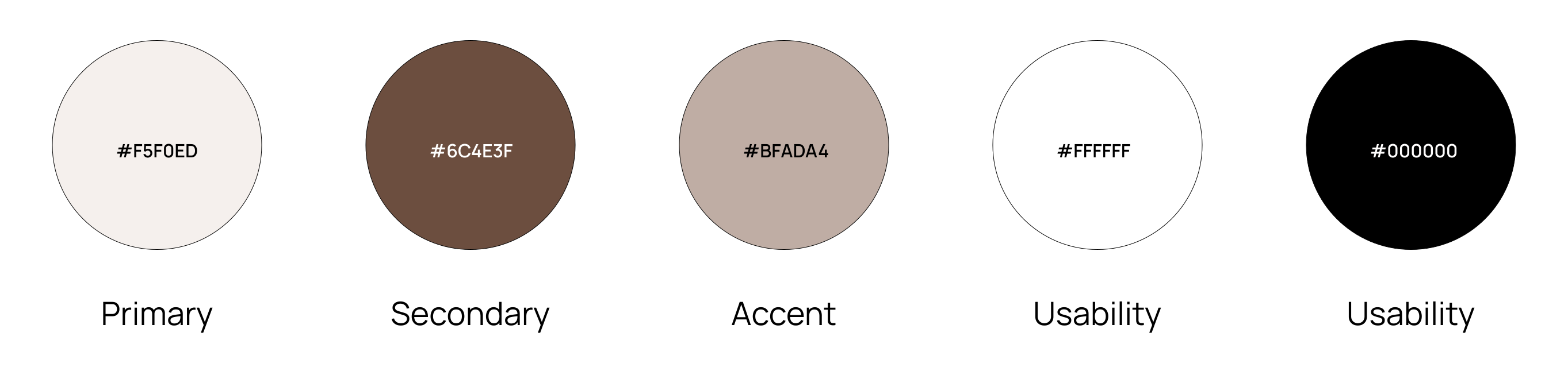
The palette is based on a light background to create a soft atmosphere contrasted by an elegant brown used for the main text and buttons. White blocks host testimonials, providing visual breathing space and improved readability of the content.
In terms of typography, Adamina is used for titles and headings, giving the site an elegant and assertive identity, with paragraphs in Raleway, a modern sans-serif font that ensures readability and balance.
The header with a temporary logo and menu introduces the site with a clear tagline and guides the user to the main content.
The header with a temporary logo and menu introduces the site with a clear tagline and guides the user to the main content.

The portfolio preview placed just after the header immediately captures attention and showcases flagship projects.
Horizontal scrolling with arrows makes it easy to explore without lengthening the homepage, allowing faster access to other information.
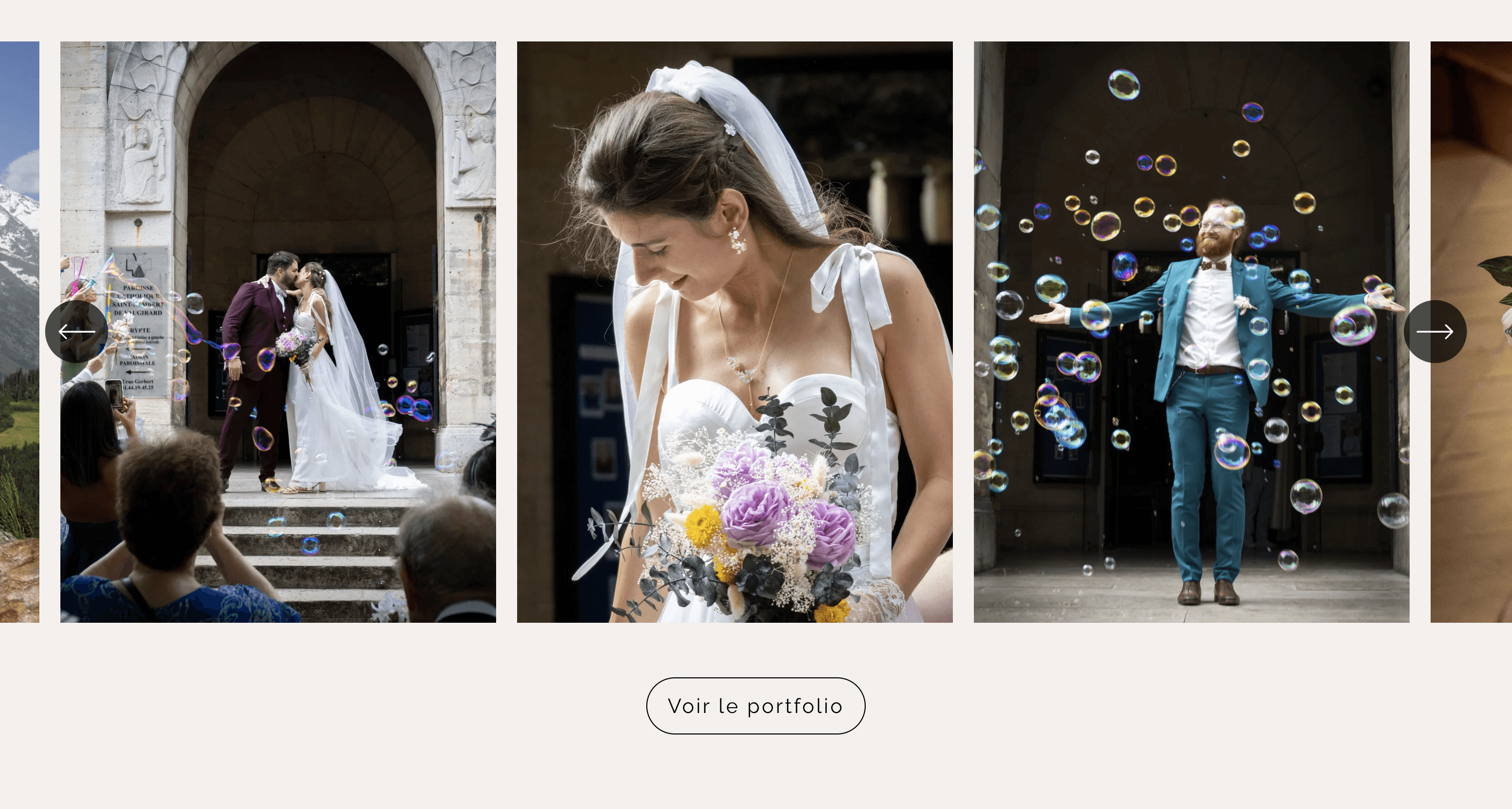
The portfolio preview placed just after the header immediately captures attention and showcases flagship projects.
Horizontal scrolling with arrows makes it easy to explore without lengthening the homepage, allowing faster access to other information.
The portfolio page displays photos selected by the photographer in the form of visual thumbnails. Their appropriate size, grid layout, and horizontal scrolling provide smooth and intuitive navigation without weighing down the page.
The portfolio page displays photos selected by the photographer in the form of visual thumbnails. Their appropriate size, grid layout, and horizontal scrolling provide smooth and intuitive navigation without weighing down the page.

The testimonials have been integrated into strategic pages such as the homepage and the “Wedding” page.
With a photo and a white frame for greater readability, they offer visitors a human and reassuring experience while conveying the emotion and authenticity of customer feedback.
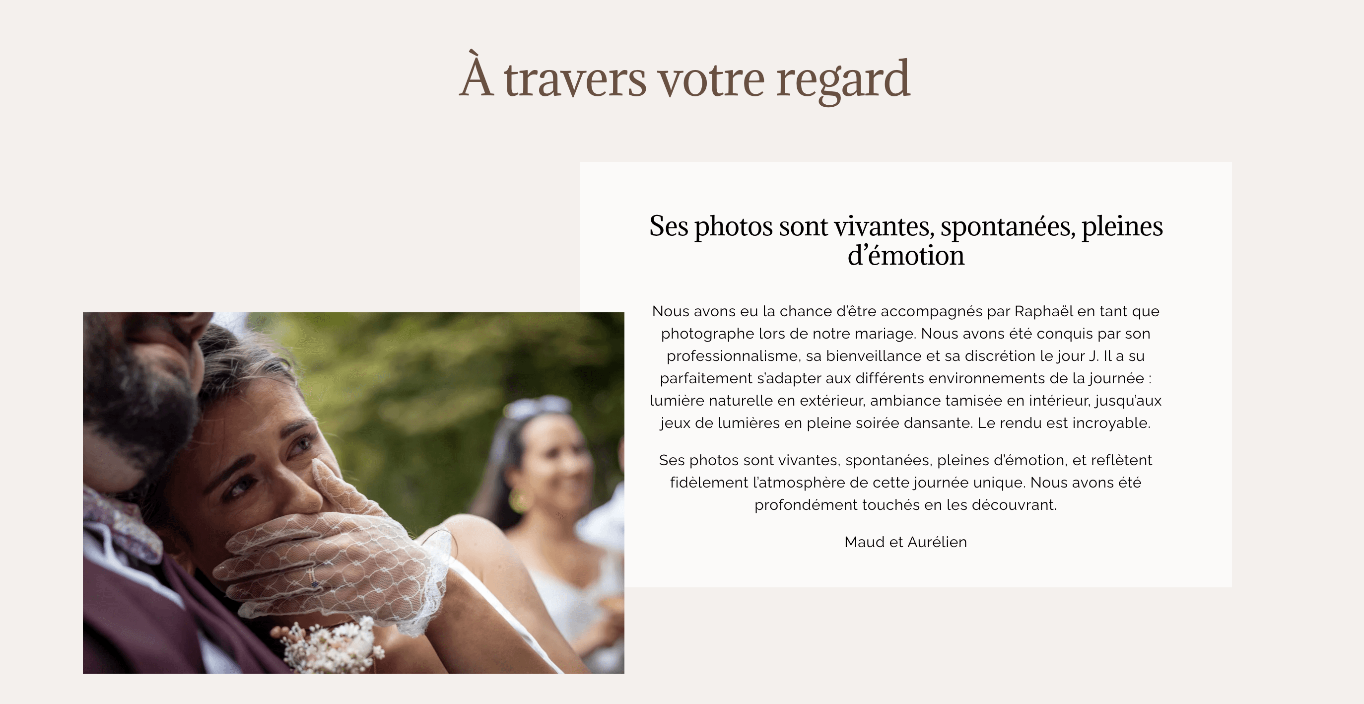
The testimonials have been integrated into strategic pages such as the homepage and the “Wedding” page.
With a photo and a white frame for greater readability, they offer visitors a human and reassuring experience while conveying the emotion and authenticity of customer feedback.
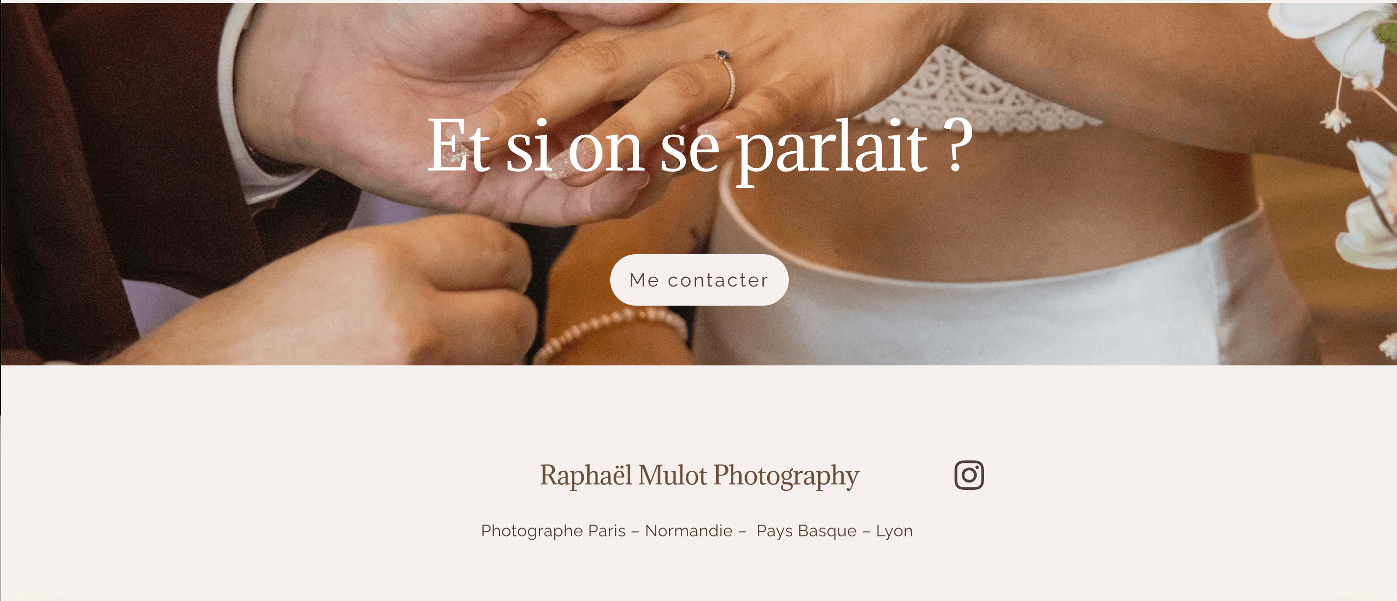
Located at the bottom of almost every section except the contact page, this area serves as a visual call to action that makes it easy to get in touch while adding an emotional touch.
The current image is temporary until a more legible and suitable photo is found.
Located at the bottom of almost every section except the contact page, this area serves as a visual call to action that makes it easy to get in touch while adding an emotional touch.
The current image is temporary until a more legible and suitable photo is found.
Challenges and Next Steps
Challenges and Next Steps
The main challenge was working within Squarespace's constraints, which limit certain customizations, while meeting the client's requirements, showcasing the projects, and ensuring clear navigation.
The next steps include replacing the temporary visuals, optimizing readability and user journeys, and exploring future UX/UI improvements.