UX/UI – Figma
News site / Culture
Le miroir Persan
Le miroir Persan
Le miroir Persan
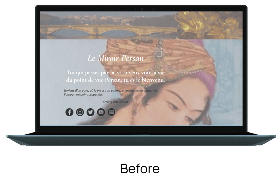
The Persian Mirror, active for 13 years on Facebook to relay news from the Persian-speaking world, wishes to strengthen and modernize its website.
The Persian Mirror, active for 13 years on Facebook to relay news from the Persian-speaking world, wishes to strengthen and modernize its website.

My role
My role
My role
UX/UI Designer
UX/UI Designer
UX/UI Designer
Client
Client
Client
Le miroir Persan
Le miroir Persan
Le miroir Persan
Tools
Tools
Tools
Figma
Figma
Figma
Context
Context
With 25,000 followers on Facebook, Le Miroir Persan, the leading media outlet for news from the Persian world, is modernising its website to strengthen its audience and gain independence from social media.
Contexte
With 25,000 followers on Facebook, Le Miroir Persan, the leading media outlet for news from the Persian world, is modernising its website to strengthen its audience and gain independence from social media.
Objectives
Objectives
Objectives
Build a simple, accessible website tailored to the age and needs of the target audience (50+), while reflecting the richness of a culture.
Build a simple, accessible website tailored to the age and needs of the target audience (50+), while reflecting the richness of a culture.
How can we offer a website that is accessible, modern and faithful to the cultural and journalistic spirit of the media?
How can we offer a website that is accessible, modern and faithful to the cultural and journalistic spirit of the media?
My approach
My approach
My approach
I place the user at the heart of every decision by combining market and competitor analysis to ensure that the design is relevant.
Throughout the process, I ensure that the design is accessible for a smooth and understandable experience.
UX research and discovery
Benchmarking and competitor analysis
User interviews and personas
Customer journey map
Architecture and navigation
User flow
Sitemap
Wireframes
UI design
Prototypes and testing
Summary
Summary
Summary
Benchmark
Analysis of existing news sites (Iran International, Iran Focus, Franceinfo) and cultural sites (Toutelaculture, Weculte, France-Iran) to identify best practices and frustrations.
Analysis of existing news sites (Iran International, Iran Focus, Franceinfo) and cultural sites (Toutelaculture, Weculte, France-Iran) to identify best practices and frustrations.

Findings and assumptions:
Existing anxiety-inducing news sites
Reliability of information: which political party does the site support?
Long homepages with too much information
Findings and assumptions:
Existing anxiety-inducing news sites
Reliability of information: which political party does the site support?
Long homepages with too much information
User interview
User interview
Interviews with 6 readers: 3 reader/artists and 3 classic readers
Interviews with 6 readers: 3 reader/artists and 3 classic readers


Personas
Personas
Development of two types of detailed personas, built from interviews that incorporate key criteria such as age, location, profession, goals, motivations, and the barriers of each target user.
Development of two types of detailed personas, built from interviews that incorporate key criteria such as age, location, profession, goals, motivations, and the barriers of each target user.


UX/UI Opportunities
UX/UI Opportunities
Based on the customer journey, several opportunities for improvement were identified and guided the design choices:
Based on the customer journey, several opportunities for improvement were identified and guided the design choices:
Clear segmentation of categories: a section dedicated to artists to easily offer content
Clear segmentation of categories: a section dedicated to artists to easily offer content
Easy sharing: visible and identifiable share buttons
Easy sharing: visible and identifiable share buttons
Personalised newsletter: tailored to each user's interests
Personalised newsletter: tailored to each user's interests
Concise home page: direct access to information without excessive scrolling
Concise home page: direct access to information without excessive scrolling
Simplified publication process: clear guidelines, acknowledgement of receipt and progress tracking
Simplified publication process: clear guidelines, acknowledgement of receipt and progress tracking
Reassuring design: clear layout and credible visual identity
Reassuring design: clear layout and credible visual identity
Wireframes
Wireframes
The sketches allowed me to quickly visualize and test design ideas while adjusting them to effectively meet user needs.
The sketches allowed me to quickly visualize and test design ideas while adjusting them to effectively meet user needs.


UI design and prototypes
UI design and prototypes
The colour palette and typography were designed with the target audience in mind, which is largely made up of people over 50, in order to provide them with a website that is as accessible as possible.
The palette combines warm, reassuring tones with deep, contrasting colours to ensure readability and credibility. The amber red draws the eye, while the white background provides clarity and breathing space.

The chosen typography has been designed to prioritise information. It distinguishes between menu items (Poppins) and content (Source Serif Pro) while reinforcing the editorial identity of the media.
The chosen typography has been designed to prioritise information. It distinguishes between menu items (Poppins) and content (Source Serif Pro) while reinforcing the editorial identity of the media.
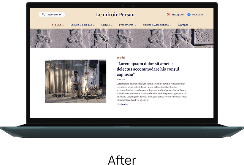
The navigation bar has been designed to segment the news while incorporating a section dedicated to artists.
The navigation bar has been designed to segment the news while incorporating a section dedicated to artists.

Clear visual hierarchy : differentiated colours and typography.
Clear visual hierarchy : differentiated colours and typography.
Interactive feedback and accessibility: interactions on sections and icons that are explicit for the user.
Interactive feedback and accessibility: interactions on sections and icons that are explicit for the user.
Reassuring atmosphere: hero header illustrated with Persepolis, a symbol of Iranian history and identity.
Reassuring atmosphere: hero header illustrated with Persepolis, a symbol of Iranian history and identity.
The body of the article has been designed in line with online press standards, with simple navigation, continuous reading and controlled scrolling to limit the length of the page for optimal reading comfort.
The body of the article has been designed in line with online press standards, with simple navigation, continuous reading and controlled scrolling to limit the length of the page for optimal reading comfort.

A section dedicated to the most popular articles allows readers to quickly find the most viewed content. This encourages engagement while highlighting the editorial credibility of the media outlet.
A section dedicated to the most popular articles allows readers to quickly find the most viewed content. This encourages engagement while highlighting the editorial credibility of the media outlet.


Next steps
This project allowed me to design a clear and accessible editorial website. The main challenge was to prioritise content while limiting scrolling.
The prototypes validated my UX/UI choices, and the next steps include internal pages and responsive adaptation.
This project allowed me to design a clear and accessible editorial website. The main challenge was to prioritise content while limiting scrolling.
The prototypes validated my UX/UI choices, and the next steps include internal pages and responsive adaptation.